css实现画面转场以及边框线条动画
迪丽瓦拉
2024-06-01 18:25:20
0次
效果预览
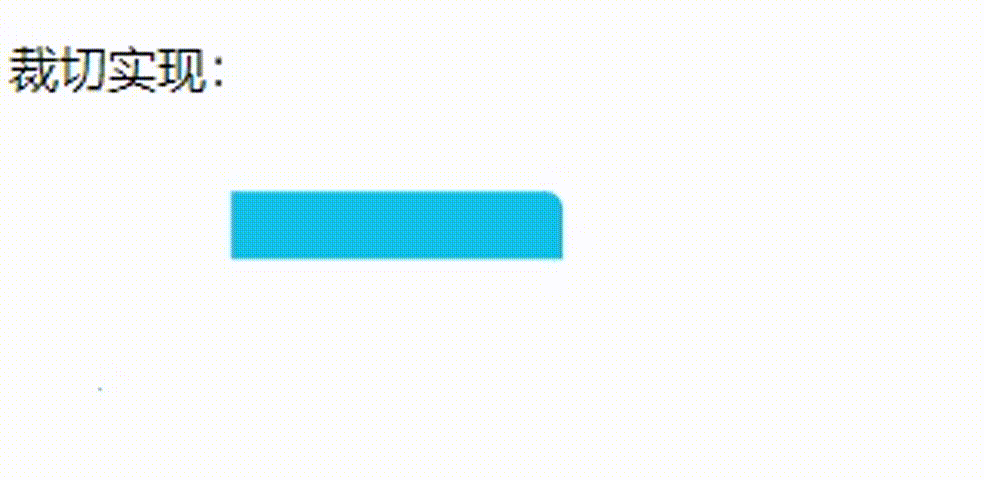
在实现转场效果之前,需要先了解css的clip-path属性,该属性就是实现转场的核心属性,clip-path属性可以使用裁剪方式创建元素的可显示区域。区域内的部分显示,区域外的隐藏。也就是说裁切的大小不会超过实际的大小,超出的隐藏,实际大小内的显示。
clip-path的属性有下面几个:
| 属性 | 说明 |
|---|---|
| inset() | 四个参数,上右下左, 定义一个 inset 矩形。 |
| circle( ) | 定义一个圆形, 语法:circle(x轴(大小) at x轴坐标 y轴坐标); at后为剪切的位置,第一个参数左右,第二个参数上下 |
| ellipse(); | 定义一个椭圆(使用两个半径和一个圆心位置)。语法:ellipse(x轴偏移 y轴偏移 at x轴坐标 y轴坐标) |
| polygon(); | 定义一个多边形(使用一个 SVG 填充规则和一组顶点)。四个参数,上右下左,每个位置的第一个参数代表左右偏移,第二个参数代表上下偏移 |
| path(); | 定义一个任意形状(使用一个可选的 SVG 填充规则和一个 SVG 路径定义)。 |
详细说明请看文档:https://developer.mozilla.org/zh-CN/docs/Web/CSS/clip-path
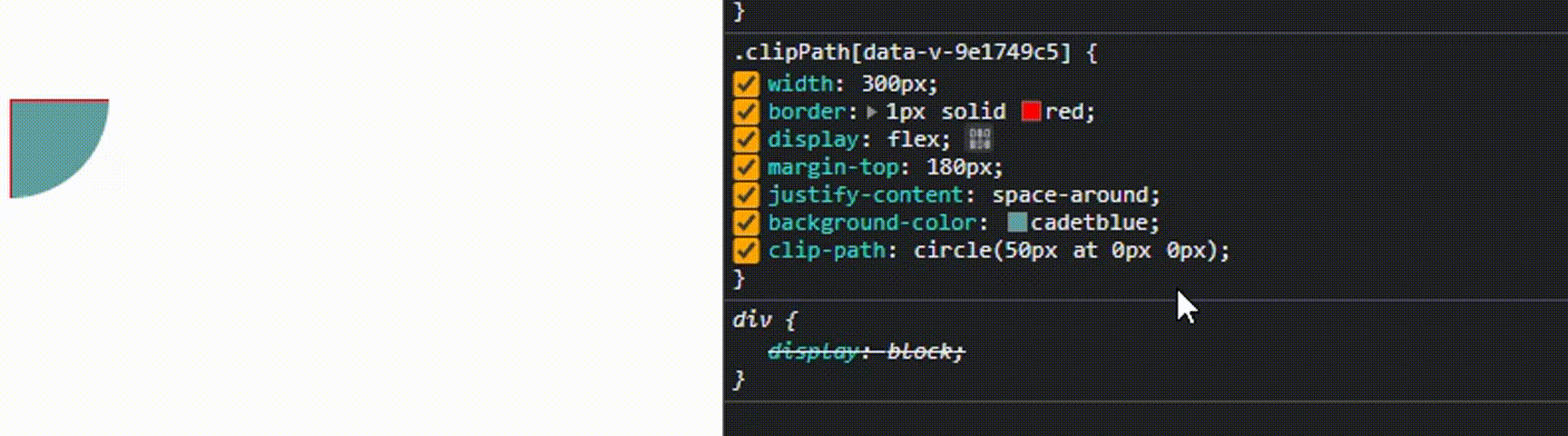
这里以circle()属性做演示,circle可以定义一个圆形(使用一个半径和一个圆心位置),第一个参数为半径也就是大小,第二个参数为圆心位置,也就是x、y轴的坐标。
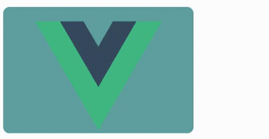
了解了这个之后就可以开始写转场动画了,先定义原始的展示元素vue.svg,当鼠标移入vue.svg元素时显示转场后的动画vite.svg,并且转场后的动画(vite.svg)要覆盖原动画(vue.svg)。
![]()
![]() // js部分
// 鼠标移入
const touchStatus = ref(false)
const touch = () => touchStatus.value = true
// js部分
// 鼠标移入
const touchStatus = ref(false)
const touch = () => touchStatus.value = true
.fillAnimation{width: 300px;height: 200px;border-radius: 10px;overflow: hidden;position: relative;background-color: cadetblue;display: flex;justify-content: space-around;align-items: center;
}
.clipPathAnimation{width: 300px;height: 200px;position: absolute;top: 0;left: 0;display: flex;justify-content: space-around;align-items: center;background-image: linear-gradient(to right, #12c2e9 , #c471ed);clip-path: circle(0px at 0 0px);  /*初始的时候大小为0,不显示*/
}
/*鼠标移入触发*/
.touch{animation: clipPathAn 2s forwards;  /* forwards 保持动画结束时的效果 */
}
@keyframes clipPathAn {from { clip-path: circle(0px at 0 0px);  }to { clip-path: circle(200% at 0 200px); }  /* 结束时大小变为200%,超出实际大小的隐藏,所以这里还是显示的原大小,也就是100%,这里变为200%是因为锚点在最左侧,100%只能显示原图的一半,所以要写成200%。 */
}
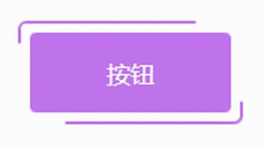
边框动画
clip-path的另一种实现:边框动画
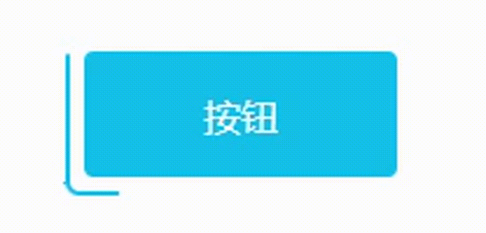
clip-path只有裁剪的区域才会显示,利用animation动画,动态修改clip-path的值来实现元素移动的视觉效果。效果示意图:
实现该效果后,在动画上方添加一个蒙版,将不需要的部分遮住即可实现边框动画。
按钮
.borderLine{width: 150px;height: 70px;margin: 30px;position: relative;border-radius: 6px;overflow: hidden;/* 内部的盒子-遮住动画不需要的部分 */.borderCenter{position: absolute;top: 2px;left: 2px;width: calc(100% - 4px - 12px);height: calc(100% - 4px - 12px);text-align: center;border:6px solid white;border-radius: 4px;background-color: #fff;z-index: 10;.innerButton{width: 100%;height: 100%;display: flex;align-items: center;justify-content: space-around;color: #fff;border-radius: 4px;background-color: #15c0e9;}}&::before,&::after{content: "";display: inline-block;width: 150px;height: 70px;position: absolute;background-color: #15c0e9;animation: insetRound 3s infinite linear;  /* linear 从开始到结束的速度相同的动画 */}&::after{animation: insetRound 3s infinite -1.5s linear;   /* insetRound动画 持续3s 无限循环 提前1.5s(负数提前,正数延迟) 匀速播放 */}
}@keyframes insetRound {0%,100%{clip-path: inset(0 0 96% 0); /* x轴左上 */}25%{clip-path: inset(0 0 0 98%);  /* x轴左上 */}50%{clip-path: inset(96% 0 0 0);  /* x轴左上 */}75%{clip-path: inset(0 98% 0 0); /* x轴左上 */}}
box-shadow实现:边框动画
类似的边框动画效果,使用box-shadow也可以实现。
.box{box-show : 0px 0px 0px 0px #ccc;
}
box-show有5个参数
- 第一个参数: 控制元素阴影的左右位置
- 第二个参数: 控制元素阴影的上下位置
- 第三个参数: 控制元素阴影的模糊程度
- 第四个参数: 控制元素阴影的大小(放大&缩小)
- 第五个参数: 设置元素阴影的颜色
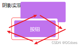
斜角度移动阴影显示的位置,将超出红色边框的部分隐藏即可。
按钮
.borderShow{width: 150px;height: 70px;margin: 30px;position: relative;border-radius: 6px;overflow: hidden;border: 1px solid red;display: flex;justify-content: space-around;align-items: center;&::before,&::after{content: '';position: absolute;top: 2px;left: 2px;width: calc(100% - 4px - 12px);height: calc(100% - 4px - 12px);text-align: center;border:6px solid white;border-radius: 4px;background-color: #fff;animation: showRound 3s infinite linear;}&::after{animation: showRound 3s infinite -1.5s linear; /* insetRound动画 持续3s 无限循环 提前1.5s(负数提前,正数延迟) 匀速播放 */}/* 内部的盒子 */.borderShowCenter{position: absolute;top: 8px;left: 8px;width: calc(100% - 4px - 12px);height: calc(100% - 4px - 12px);text-align: center;border-radius: 4px;display: flex;justify-content: space-around;align-items: center;color: #fff;background-color: #c073ed;z-index: 10; /* 覆盖伪元素 */}
}
@keyframes showRound {/* box-shadow : x轴 y轴 模糊 放大 颜色; */0%,100%{box-shadow: 0px -66px 0px 0px #c073ed; /* 上 */}25%{box-shadow: 146px 0px 0px 0px #c073ed; /* 右 */}50%{box-shadow: 0px 66px 0px 0px #c073ed; /* 下 */}75%{box-shadow: -146px 0px 0px 0px #c073ed; /* 左 */}
}
案例源码:https://gitee.com/wang_fan_w/css-diary
如果觉得这篇文章对你有帮助,欢迎点赞、收藏、转发哦~
相关内容
热门资讯
Linux-scheduler...
四、调度域 SDTL结构 linux内核使用SDTL结构体来组织CPU的层次关系 struct sc...
leetcode - 2379...
Description You are given a 0-indexed string block...
Retinanet网络与foc...
参考代码:https://github.com/yhenon/pytorch-reti...